When your customer decides which emails to keep and which to cull, it’s a great opportunity to find out who really wants to receive your emails.
Ideally, you want to have a list of people who want your emails and for those who don’t, you can let them go. As sad as it is to lose them when they do want to unsubscribe, make sure it’s a good experience. A good unsubscribe experience means you’ll avoid complaints which can have a negative impact on your deliverability of future emails and/or land you in hot water with regulatory bodies. In this blog, we discuss 5 design mistakes to avoid in the unsubscribe experience.
1. Email footers not optimised for mobile
If you haven’t already optimised your email for mobile then it’s time you do. In 2017, Litmus reported that 51% of all email opens were on mobile. Email-footer areas that aren’t optimised for mobile screens make it difficult for users to unsubscribe because the print is either too small, hard to read, or cannot be located. Properly optimising footers for email make the process less challenging and more convenient for the user. You never want your users to unsubscribe but it’s important that the option to is accessible and easy.
2. Unsubscribe links that are difficult to locate
Trying to ‘hide’ the unsubscribe link from your users isn’t a strategic approach, it’s annoying for the users. The most appropriate place for your unsubscribe link is in the footer and it should be one of the most noticeable links. It pays to make your unsubscribe link obvious by bolding the font or using a high contrast colour and making sure that it’s easy to click/tap. You should also always label your unsubscribe link with the word ‘unsubscribe’. Linking to the word ‘here’ can sometimes throw users off so it’s best to avoid any confusion by just linking to the word unsubscribe.
3. Unsubscribe confirmations emails
When someone hits the unsubscribe link in your email its almost never a mistake so don’t make it hard for them to finish the process. It’s also unnecessary to send them a confirmation email asking them “do you really want to go?” or asking them to log in to their account to confirm their unsubscribe. Users can have nothing personal against your brand but prefer to keep their inbox clean of irrelevant newsletters and promotions. Don’t take each unsubscribe personally, instead use it as feedback for how you can improve your emails whether that be with more personalised, engaging content or adjusting the frequency of your emails.
4. Asking users to log in or provide personal information
Similar to the point above, this is another unnecessary barrier that will just aggravate and confuse users. Asking someone to log in to an account just to unsubscribe is one of the most frustrating email experiences you can put a user through. It isn’t just bad practice, but also against the law in many countries including New Zealand. The unsubscribe process all comes down to ease.
5. Pushing users to resubscribe
If a user has made it to the unsubscribe page, it wasn’t by accident, it’s better to let them go. Below are a few examples.
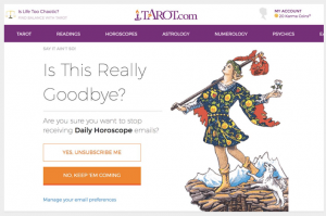
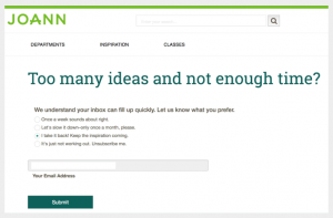
You’ll notice that in both images the settings are preset to keep the user subscribed. This is seen as a bad experience as it’s best to leave all options unticked. If you’re in a rush or not paying close attention, you might hit the submit without realising you actually clicked “I take it back! Keep the inspiration coming”.
So, what’s the ideal unsubscribe experience?
The unsubscribe link should be easy to find, easy to click or tap, and there should be no barriers for the user. It’s good practice, however, to make it clear that users have been unsubscribed from your list so taking them to a confirmation landing page where they can see they’ve been removed is a good idea.
Want to improve your email campaigns? Get in touch today if you need help with anything from strategic planning to platform selection, design, integration and deliverability.
It’s natural to be a little nervous when it’s time to hit the send button, especially if an email is going to thousands of people. Here’s a list that 15 years of email marketing excellence has told us are the crucial things you must check before you send every campaign.