Delivering a great welcome email is a crucial step in creating a successful onboarding experience for your future customers.
As we explain in our comprehensive 20-page guide The Marketer’s Guide to Great Welcome Emails, there are some key steps to getting your welcome email to full potential. We signed up to 25+ email lists from international and national retail, entertainment, car, news and banking brands, and developed a criteria to qualify their sign up process and welcome email. These criteria took into account user experience, marketing strategy, design and other elements. Here is a list of our favourite welcome emails and the reasons why we think they’re truly great.
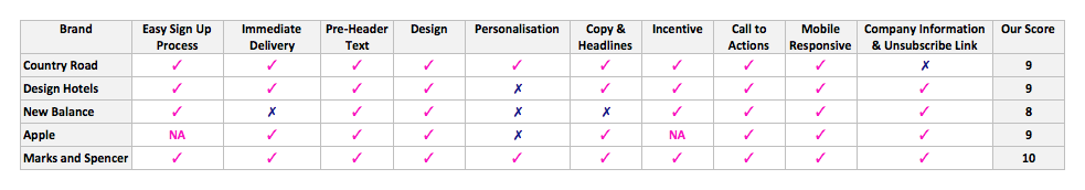
Our top picks
1. Country Road
We love Country Road’s approach to welcome emails because from start to finish, it does a great job at moving their subscribers through their onboarding process before inviting them to shop.
Easy Sign Up Process
Most subscribers resent sign up forms that interrupt their browsing experience and then ask to fill out too many ‘required’ fields. So when it comes to sign ups, it’s important to define clear conversion goals, and only ask for as much information as you need.
Country Road’s sign-up process is straight forward. You can easily access the form from the header menu of their home page which makes it visible and mindful of the user experience. Even though the conversion rate of discrete sign up form like Country Road’s may be lower than that of a popover offering a discount on first purchase, in this case Country Road is choosing quality over quantity. This strategic approach results in better qualified leads that are likely to be more suited to their product focused email marketing strategy.
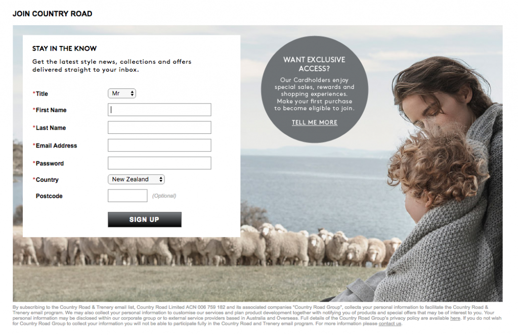
Country Road’s sign-up page is beautifully designed, and it offers a clear incentive to become a customer. They use a message that makes their subscribers feel exclusive, which ties in with their brand personality. My sign up form was pre-populated with my chosen location, and it displayed a thank you message after sign up to confirm I would receive an email soon. These easy-to-implement actions made my sign up experience a whole lot nicer.
Immediate Delivery
With the rise of digital marketing, consumers have become more empowered than ever to get what they want, when they want it. Waiting has become a thing of the past. So sending a welcome message to your subscribers a week or a month after they sign up defeats the purpose of inviting them to join your email list in the first place. A welcome email should be timely, not only to reassure your subscribers that their sign up was successful but also to stay top of mind.
Sometimes browsing your website is not enough to learn about your brand, especially if your website design is complex, cluttered or does not offer enough information. Unless your website explains clearly and visibly who you are and what you do, chances are your subscribers may go straight to your products or pricing pages without knowing what makes you different, or why they should purchase from you.
Always consider the user first. You only have one chance to explain, engage and convert. We analyse user behaviour through research, analytics, heat-maps and A/B testing. Then we wireframe, test and implement changes to improve conversion rates. Get in touch to get a free proposal from a user experience expert.
As a new visitor who’s never purchased from Country Road, my first impression of their brand was quite dull. From browsing their home and catalogue pages, I could infer that their products were stylish and expensive but it didn’t really tell me much about what makes them different, so I’m probably not going to make a purchase from them anytime soon.
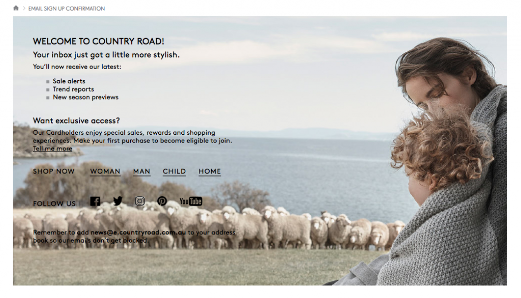
On the bright side, their welcome email was delivered immediately after sign up, and it did a great job at showcasing their brand’s style. Plus it reminded me about their sales alerts and cardholders’ exclusive offers which made me think about their stylish products again.
Great Use of Personalisation
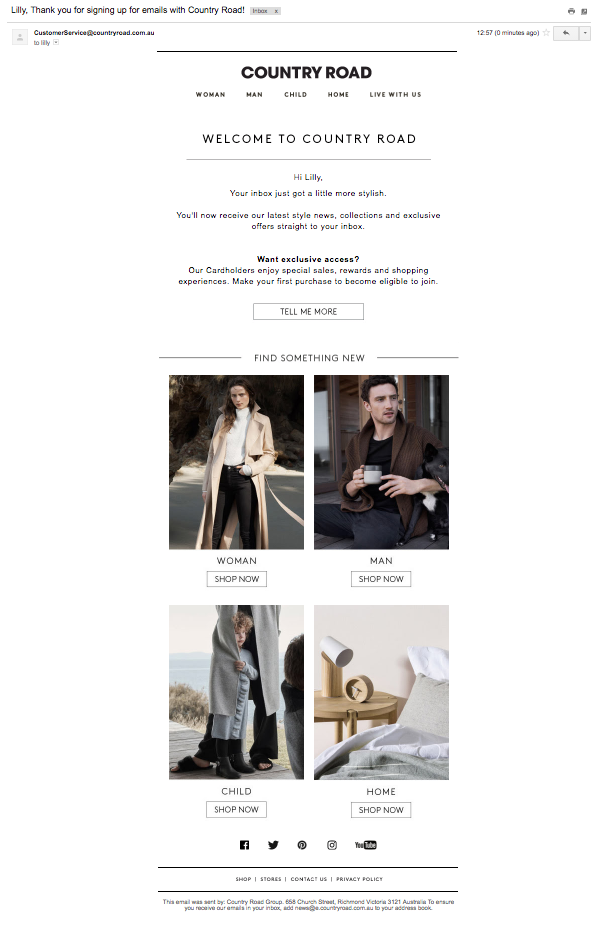
We are living in the era of personalisation. Emails with personalised subject lines are 26% more likely to be opened and marketers have found a 760% increase in email revenue from segmented campaigns, according to Campaign Monitor. So using your subscriber’s first name in your emails, the most basic form of personalisation, is no longer a choice. It’s almost not enough. I was glad to see that Country Road used my first name in their subject line and greeting, and they spelled it correctly!
Simple but Effective Copy and Design
Country Road’s tone of voice was friendly while being consistent with their branding. Their message is clear and engaging and highlights the value of keeping an eye on their emails. They make great use of headlines and white space, which helped me scan their email more easily. This was particularly helpful as I was reading it on my mobile.
Country Road’s email design was minimalistic but effective. It had no fancy design work or videos but used beautiful images and clear call to actions to entice me to browse the different categories in their store. Plus their modular email template displays nicely on mobile.
Small but Powerful Incentive
Another standout feature of this welcome email was their small but powerful call to action. They made me feel exclusive by giving me access to their customer’s card without having to offer a discount on their products. This simple but effective tactic gave me further insights into their brand positioning in the New Zealand fashion scene.
A clear and visible call to action to find out more about their cardholders’ exclusive access made it very clear of what my next step should be: making a first purchase to be eligible to join, which was complemented by stunning images of their products.
A few steps from being perfect
Overall, Country Road’s welcome email was one of the best we received during our research. Even though it satisfied most of our criteria, it is still a few steps away from perfection. Here are some of the things they could do to improve:
- Reduce the number of required and/or visible fields in their sign up form (eg. Title, Last Name, and Country).
- Use the field Title to personalise the content of their emails for each gender segment.
- Use progressive profiling to gather further insights about their subscribers, for example, at checkout or in subsequent emails.
- Add pre-header text to their emails to grab the attention of their readers.
- Add an unsubscribe link to the footer of their emails to comply with New Zealand Spam Regulations. This is an extremely important part of the anatomy of every marketing email and the lack of an unsubscribe link could lead to serious consequences for Country Road. To learn more about it, read this comprehensive 16-page guide including a Marketer’s Compliance Checklist so you can tell if your company is protected and your marketing and communications teams are doing the right thing.
- Send a series of welcome emails (usually three to five) a week after each other explaining different parts of their business. And start their welcome series by educating their subscribers about their brand, and gradually introducing products and prices towards the end of the series.
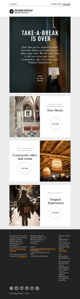
2. Design Hotels™
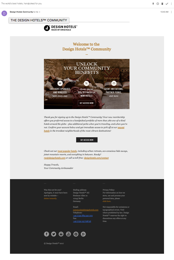
I loved Design Hotels’ account confirmation email! In fact, this is one of the best account confirmation emails I’ve ever received. Not only it’s beautifully designed but it also explains clearly all of the benefits of confirming my account, including a super enticing 50% off their newest hotels.
Their welcome email was equally well designed, and featured eye-catching images of some of their best hotels to incentivise me to use my 50% discount. They make great use of their pre-header text and headlines throughout their welcome email, and include a link in the footer to allow me to update my preferences.
Design Hotels’ tone of voice is quirky and fun, just like their brand personality, and their message conveys clearly what to expect from their future emails. Unfortunately, their email did not use any form of personalisation as they only asked for my email address when I signed up, but aside from that, Design Hotels is doing a great job at welcoming their new subscribers.
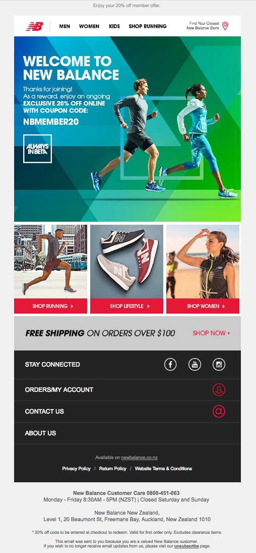
3. New Balance
Signing up for New Balance’s emails was really easy. They use a small popover on their website that displays immediately when you start browsing, although it didn’t feel too intrusive as they use a small size popover that shows up on the left-hand side of their home page. The popover offered a 20% discount off my first purchase, which was effective at convincing me to join, although their email took a little while to arrive, so I quickly forgot about their offer and never used it.
Their design is consistent with their branding, and their pre-header text and headlines stand out when reading this email. However, this email is very product-focused. There was no mention of who New Balance is or what I should expect from signing up to their emails.
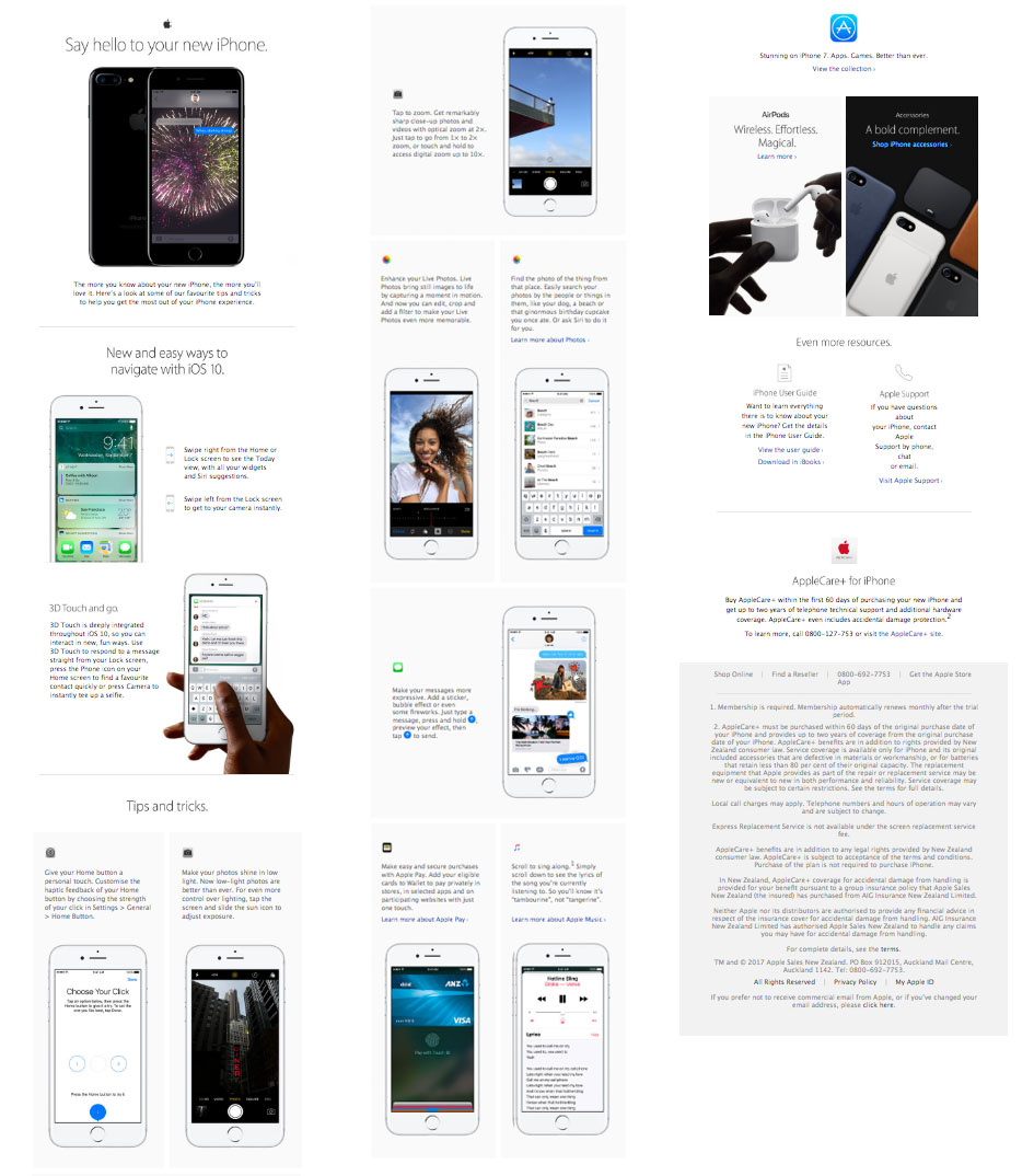
4. Apple
Apple’s email was quite different from the rest. It was immediately delivered after configuring my new iPhone 7, and did an excellent job at explaining how to use it.
The email was quite long but easy to scan. Apple uses stunning images, supported by short and simple instructions, to educate their customers on how to use their new phones. Plus there’s small call to action towards the bottom of the email that entices readers to view their collection of apps.
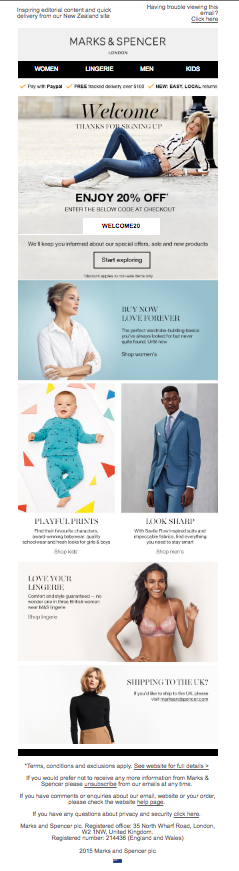
5. Marks & Spencer
What a nice welcome I got from Marks & Spencer! I could not pick a single flaw in their welcome email. Straight forward sign up, immediate delivery, beautiful design, educational copy, effective call to actions… This email has it all. My only suggestion would be to use a series of emails, instead of one to continue to educate their subscribers about their brand, and/or remind them to use their offer before it expires.
Our Scores
Getting your Welcome program to full potential should be broken down into 3 parts:
– SUBSCRIBE: When it comes to your sign up process, make sure it is easy and tempting to subscribe.
– THE FIRST EMAIL: Deliver the first Welcome email promptly and make the most of the opportunity it offers you (being the most read email you will ever send) by utilising it to educate and involve your new subscriber. Welcome your new subscriber warmly and help them to understand how to get the best from you.
– FUTURE EMAILS: Continue engaging readers with regular, high quality content and keep improving your email program so the message is there just when your recipient is ready to receive it.
Lastly, before you launch your new Welcome email use this checklist to ensure it’s entertaining, informative, shareable, engaging, and rewarding. And most important of all make it valuable and useful! If you’d like to have your Welcome email example(s) reviewed by the expert team at Calibrate we’d love to help. Send it to hello@calibrate.co.nz with ‘Welcome email review’ in the subject line.
Your Welcome email or series is your first impression. It greatly influences how potential customers feel about your brand, making it one of the most important pieces of communication you will ever deliver.
We evaluated 23 welcome campaigns by local and international businesses to provide you with a list of practical tips and a checklist for developing or improving your welcome email and subscription process.